As social and political issues overwhelm the media, companies are working harder than ever to cut through the clamor and grab the attention of their desired consumers. Interestingly, this cacophony has led to the liberation of graphic design. Visual marketing and advertising trends soaring in popularity are perhaps best characterized by a feeling of daring independence — strict structures are crumbling, wacky effects reign supreme and colors are flashier and louder than ever!. Graphic designers seem to have gone back to their roots as artists, experimenting and mutating previously worn-out practices.
Let’s explore some of these trends that, in some ways, are giving voice to the myriad emotions felt by many around the world.
Distorted effects
Think overlapping images, multiple light sources and “glitching” photos. Known as distorted effects, these design features are coloring everything from movie posters to retail advertisements. The result is a gritty image that can feel dark and somewhat ominous. However, when paired with bright colors it can exude a modern, edgy appeal.
Creative use of negative space
Even the use of negative space — the blank area surrounding an object — is being elevated in 2018. Negative space is often hailed as the most important part of an image, and traditionally it has been used to draw viewers to a focal point. However, graphic designers are once again flipping the script on this institution. Now, we’re seeing images merge with negative space to create a secondary feature that not only attracts the eye, but also inspires the imagination.
Broken, or cropped typography
Utilizing negative space has also proved popular in typography. It’s tough to erase parts of letters, or space them far apart and on multiple lines, while maintaining readability. When utilized correctly, however, the treatment can entice viewers to take a little more time and absorb the piece. The effect is futuristic and can be worth the risk when applied in the right context.
Bright colors and gradients
This year, muted colors are being shoved to the side by vibrant, bold palettes that shout for attention. We see this visual particularly being used in gradients, with colors gradually transforming and shifting into each other. Designers are also using this effect to incorporate various shapes and textures, creating an interesting visual that can benefit companies with a playful, lively brand personality.
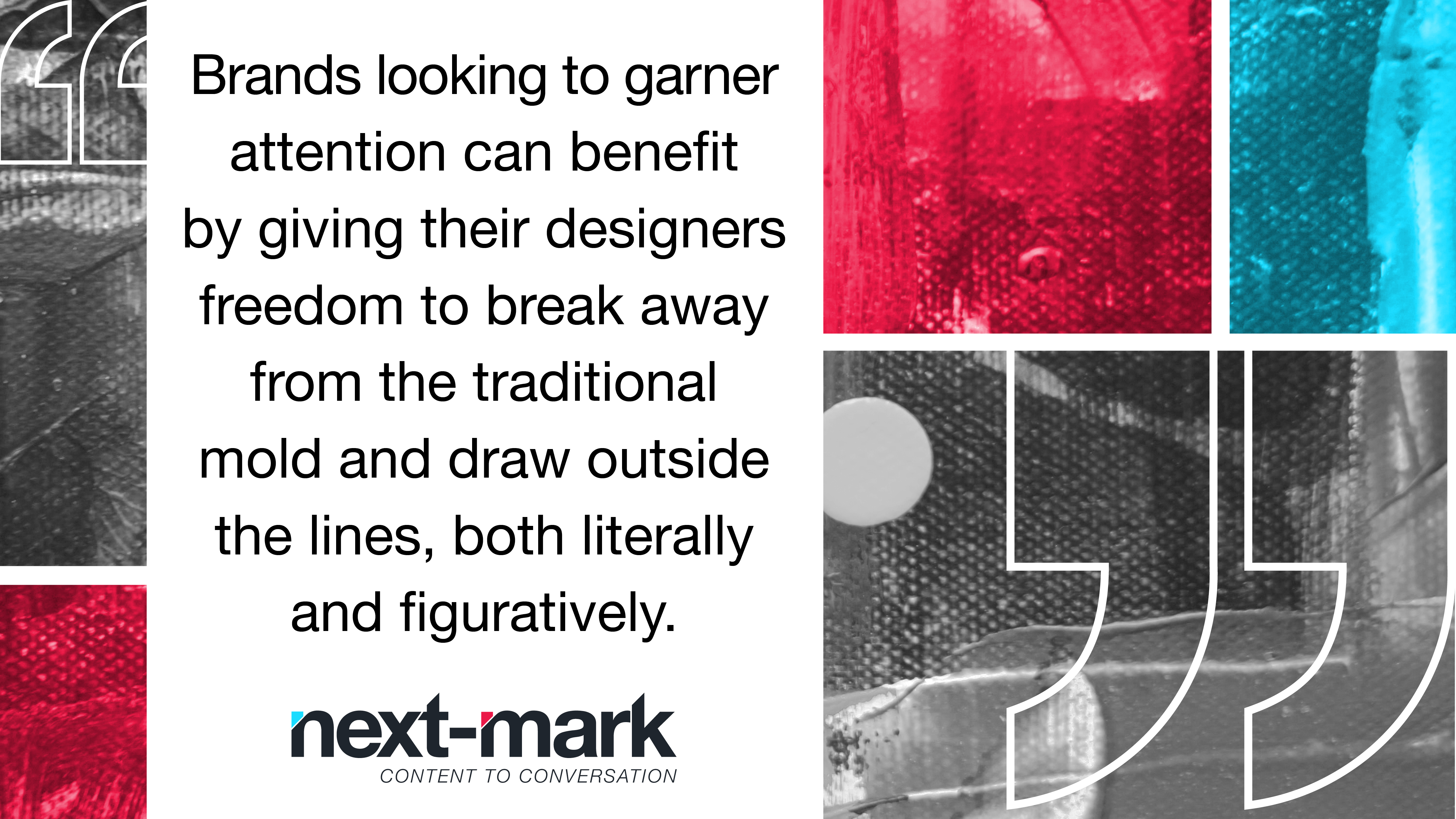
Although these trends certainly won’t work for all businesses or industries, brands looking to garner attention can benefit by giving their designers freedom to break away from the traditional mold and draw outside the lines, both literally and figuratively. However, companies also need to evaluate the longevity of these trends and whether they fit with their mission, vision and values.
Are you contemplating a visual refresh? Give us a call and let’s talk.