Looks aren’t everything: Why your website must look great AND be a conversion machine

You can drive thousands, even millions, of visitors to your site. And their jaws can drop in awe at how your homepage has filled their screen with beauty. But if only a tiny percentage of them end up becoming customers, or fans, or at least doing what you’d like them to do before going elsewhere, your site is pretty much a complete failure.

To be clear, there is nothing wrong with designing a site that looks great. It is an art and a science. And it’s far from easy. That’s because there are three essential elements to the look and feel of any good website today: branding, responsive design, and user experience. We’ll touch on each of these in detail later, and good design will certainly help the cause, but first we should talk about the ultimate goal here: conversion.

Conversion: The Website Building Analogy

When thinking about conversion, it might help to think of your website as a small business in a free-standing building with several doors. The front door is your home page. Visitors discover that your business exists, think they might have a need, and enter there. They experience your brand, interact with your receptionist, and are connected with someone who can inform them about all the different lines of business that might serve their needs. They are walking toward conversion, with your help.

The side doors, on the other hand, are your website’s landing pages. Visitors have already learned about one particular line of business and may have a shortlist of questions in hand. When they walk in this side door, they also experience your brand. But they’re not welcomed by a receptionist, they’re met by a specialist who can engage in compelling conversation immediately. In other words, there’s no sense sending them back several steps so they can enter through the front door; they’re already several steps closer toward conversion where they are.

The other side doors lead to more lines of business, just like your various landing pages should do. Visitors who arrive at one of the side doors probably don’t want the grand tour of all your business lines, at least not on their first visit. But you can certainly deepen your engagement with them after they’ve been converted to customers. This, by the way, also has to do with demand generation, which we covered in another blog entitled Demand Generation: Building Better—and more—Customers.

Okay, it’s time to return to the beauty pageant part of web design: making it look its best so that the conversion path can be as close to a red carpet experience as possible. Let’s look in a bit more detail at responsive design, branding, and user experience.

Responsive Design

The variety of screens in use today dictates the absolute necessity of using responsive design. Otherwise, the site that looks amazing on your developer’s big screen will look like a Frankensite on a smartphone—and will likely be next to impossible to navigate as well. You get responsive design by hiring developers or agency resources who would be embarrassed to build any other kind of site. Period.

Branding

All the work and thinking that has already gone into your messaging, style guidelines, logo, and other important aspects of branding need to flow naturally throughout your website, too. If you haven’t already done this “work and thinking” mentioned above, please do so now! Without it, your website is destined for mediocrity. Not a good look.

User Experience (UX)

While including solid responsive design and excellent brand thinking as you move forward, your site development or refresh project also deserves a deep look at user experience, a.k.a. UX. Thinking back to the business building analogy, this is where you stage-manage what you hope your site visitors will experience as they interact with the text, images, menus, buttons, and other elements they see—depending on which page they use to first enter your site. Whatever door they arrived at, the UX should help them find their way to where you’d like them to go. Coincidently, the way they find should lead them to, you guessed it, conversion.

Building Your Conversion Machine

Your mission is to convert visitors to paying customers, blog followers, email subscribers, first-time callers, etc. In other words, you need to compel visitors to do what you want them to do, even if that means leaving your site and never coming back. That’s just called “qualifying leads.” That’s right. In addition to being a conversion machine, your site should also work as a qualifying engine. Instead of wasting your staff’s time, along with that of your site visitors, it’s best to get your messaging and user experience so right that some visitors realize they just don’t belong there.

For those visitors you want to stay, sometimes conversions can be handled on the site itself: software trials or downloads, subscriptions, and online sales, for instance. For other types of conversions, your website simply passes visitors to your real world of sales. And, unfortunately, this can be a real black hole.

For conversions that require visitors to either fill out a contact form or call a number, you should ideally have a customer relationship management (CRM) system in place. And remember, any CRM system is only as good as the business process set up to include it in the sales or conversion workflow. Do this correctly, though, and it will work wonders for business.

Long story short, your website should be designed so that visitors can basically sell themselves on doing business with you. The progress from navigating to the point of conversion must be carefully thought out. And if the conversion includes talking with someone at your organization, make sure that the process flows naturally into the “real world” outside of the site, and that your CRM ensures that nobody falls through the cracks.

Are you ready to build or tweak that site so that it hums with new business? Now you know the essential elements for a good-looking website that thinks and works like a powerful conversion machine.
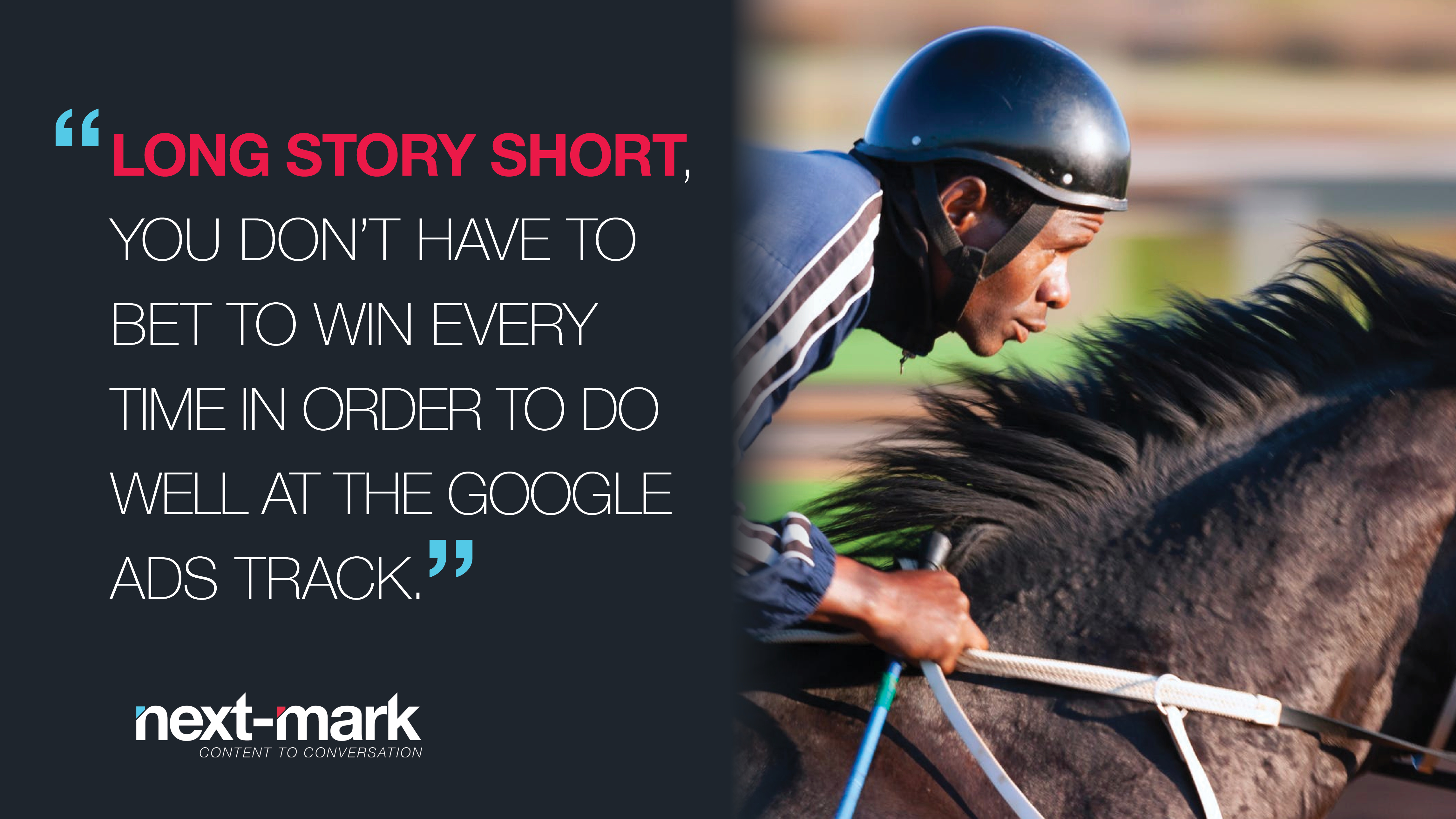
In horse racing, there are three so-called straight bets. Win means you just absolutely know that a particular horse will come in first. Good for you. Omniscience is a handy skill. Place will give you the win if your horse comes in first or second. It’s a safer bet, but with a lower potential payout. With show, you’ll be in the money even if your horse makes it onto the podium with third place. Even lower winnings, but still much more visible and memorable than fourth place.

So, what does all this have to do with Google Ads? Let’s get this back on track [pun intended]. Long story short, you don’t have to bet to win every time in order to do well at the Google Ads track. It’s not as if people only click on the very top ad. Though it’s somehow always exciting to come in first, it can get expensive pretty fast.

Just as betting on the jockey is sometimes the best strategy, doing your homework on keyword bids can pay off for your campaigns. There is often quite a gap in the winning bids it takes to get first and second place in ads returned by searches, and an even bigger gap (much lower bid) between second and third. Keep an eye on the average ranks in your campaigns and see how your lower-ranking bids are converting. After all, conversions are what you’re really after, not first-place rankings. By bidding a bit less aggressively but still being in the mix of the first several results, you might be happy with how this part of your marketing budget can bring in more cost-effective wins.

Remember, there’s always at least one winner in this Google Ads challenge. Whenever someone clicks on your ad, whether or not they end up converting via your site—Google always gets its payout for your winning bid!

Demand generation offers a powerful model for coordinating marketing and sales efforts to attract and win more business. In a way, it’s the digital transformation that reunites marketing and sales into the continuum of teamwork it should be. Marketing and sales should work in parallel, not sequentially, and as a coordinated team. For example, sales should not assume that a prospect who is talking with them has already been exposed to all the key messages being delivered via the company’s various marketing channels.

With demand generation, all roads lead to attracting and creating a better-informed customer. One who has already gained value from your content (blogs, webinars, white papers, etc.) to the extent that they are primed for worthwhile conversations with sales. And after that, demand generation suggests that the sales rep will know how to draw on additional marketing resources to deepen both the relationship with the customer and their understanding of your entire portfolio of value to them.

One of the goals of demand generation is to avoid the blind-man-and-the-elephant syndrome. In marketing, that’s when potential buyers—or even existing customers—are hyperfocused on a small subset of your offerings, unaware of other products or services they could also get from you. This is why it’s so important to ensure exposure to a variety of content during a series of contacts with your brand. Done right, demand generation will actually increase the demand for what you sell, because you will be attracting, educating, and engaging customers much more effectively than ever before.

Five things you should be doing to drive Demand Generation:

  1. Give marketing teams access to sales funnels and CRM activity
  2. For key accounts and targets, bring marketing and sales together to strategize
  3. Let sales people view and help shape marketing campaigns early in the process
  4. Expose customers to your full range of offerings through all channels
  5. Use customer surveys to show customers your full range of offerings


CPKKItchen
If you’re ever invited to a VIP Tasting event, just say yes. Especially if it’s part of a major rebranding effort, and double-especially (I used it, so now it’s a real word.) if it involves pizza. Actually, the only pizza included in this one was the new Sunny Side Up Bacon + Potato pizza. You’re correct:  two eggs on top. Now that’s what I call planning ahead if you want cold pizza for breakfast!

It’s mid-afternoon at the California Pizza Kitchen in Tampa, and the staff feels energized. This tasting is a show within a show, surrounded by actual paying customers. One reason they’re pumped up: they’re pioneers. For now, this “Taste the Next Chapter” rebranding movement only includes about a dozen of the more than 250 CPK locations. So, the general manager and the servers—all top notch and double-extremely well prepared for this matinée show—are already insiders, the advance team, the elite culinary forces sent to the front of the front to ensure all-out success for all the rest of the locations that will follow.

Ideally, the staff at all the other locations will catch this excitement, when it’s their time, because that’s actually one of the most powerful benefits of a major rebrand of this nature:  the enthusiasm and pride of the new translates into a more engaging, positive, and memorable experience for the customers. And so the business grows. Keep in mind that this large-scale rebranding effort is going on without a single tweak to the company’s logo. This is a personality change, not a logo facelift. It’s all about expectations. The experience.

Margs
The CPK rebranding project goes way beyond the menu, too. The restaurants are all going sustainable, with as many elements as possible being repurposed from elsewhere. In Tampa, they’ve created one wall entirely from a patchwork of wine crate sides. It has “Let me take a selfie”  written all over it. Not literally. I’m just saying. I’m pretty sure the old CPKs don’t have real bars where you can hang out; this one definitely does. You can twist around at the bar to watch the action in the kitchen—pizza tossing included—if the game on the flatscreen is not going your way.

Back to the new menu: The non-pizza entrées are getting the spotlight, along with the drinks. You know you’re going upscale when the menu includes suggestions for wine pairings. The Fire-Grilled Ribeye topped with creamy bleu cheese butter likes to hang out with Rodney Strong, a Cabernet Sauvignon. If you like drinking Clos Du Bois Unoaked Chardonnay, then you might want to pair that with the Hearth-Roasted Halibut. Or vice versa. (Full disclosure:  I didn’t actually see a hearth.) Being more of a beer guy myself, I love that the suggested pairing for the Mahi Mahi Tacos is Corona Extra. I didn’t make that up. Go see for yourself.

Fish
The staff continues the barrage of new dishes and sides, actions that are not lost on a table of “regular” patrons nearby. Perhaps the staff has shifted a bit too much service to our side of the house and neglected others by mistake. If anyone from CPK is reading this, you might want to bring around some samples to everyone and tip them off as to what’s going on.

Anyway, as we’re doing our best to put a dent in the desserts—this is, after all, about the tenth course of all the new items—the regional marketing guy asks us if anyone feels adventurous enough to go back to the kitchen and throw some pizza dough. And that’s when I remembered:  This is a pizza place.

Pizzatoss

If you’re a college football fan, right now you’re probably going through some major withdrawal. Thanks to a stroke or two of genius from the creatives at Pixar, though, you now have a worthy goal to pursue in the offseason:  admission to Monsters University!

The spot Pixar is running to promote its summer prequel to Monsters, Inc. is part parody, part inspiration, all monsterously perfect.

You’ve seen the sweeping, sun-drenched campus aerial shots before. Again and again, from every team’s school during every college game ever. But which school is this? The first clue is the bloated green hand that’s writing an equation on glass (probably Dr. Rufus Oozeman’s, from the School of Engineering). Then there’s the MU flag in the distance, with the eye from the Monsters, Inc. logo. But the real payoff is our first glimpse of a real monster whose first word of dialogue is “I”. And she has three eyes. Get it?

This is just a brilliant way to grab viewers’ attention, suck them into a false world of humorous wonder, and deliver them directly to the gates of the fake college website of MU. As we speak, high school seniors and their parents are counting the days until the college admissions decisions come out in April. Now everyone will be counting the hours until the release of Monsters University (June 21st, according to IMDB).

For the record (school transcript?), here’s the script of the spot:

“Imagine an education where extraordinary comes standard, and the power that drives us can’t be contained. Where those who embrace their history become those who create it.

Imagine a university where I… where I… where I (eye?) can be unique… in a family of thousands. Where I can love to learn… and learn what I love.

Your future is knocking. Open the door. Monsters University.”

Here’s some good news for those of you who can’t walk past a university store without buying some gear. The store on the MU website sells real stuff. It’s run, in real life (wherever that is), by DisneyStore.com.

See you during admit weekend! In the meantime, go get a quick marketing education now at http://monstersuniversity.com/edu.


Kudos to Microsoft, but not necessarily for the new logo design. Four colored squares. Sans serif font. As the Grinch would say:  “Cut, print, check the gate. Moving on.”

Actually, they have probably done the right thing by simply reducing the Windows(R) element to its abstract essence. No perspective, but after a trillion online and print impressions over the coming years, it will still evoke Microsoftness. When a company spends more than $9 billion on R&D every year, they tend to spend a bit on advertising, too.

So, enough about the logo. To me, the smartest thing about the rebranding effort is the lack of a tagline to go with it. True, Microsoft hasn’t stuck its latest line — “Your potential. Our passion.” — on much lately, but the absence of a tagline to accompany the new logo means that the marketing folks at Microsoft have decided to go tagline free for good. Okay, for now.

It’s not like they’ve had a brilliant heritage of tagline wisdom. As best as I can tell, here’s the whole lineage in recent memory:  “Where Do You Want To Go today?” > “Life Without Walls” > “Be What’s Next” > “Your potential. Our passion.” Maybe you see it, but I don’t find any “Just do it.” winners in the bunch.

There are really only two solutions for any decision about a company’s tagline:  work the challenge ridiculously hard until you find the only word or set of words that completely expresses the essence of the brand, or shut up.

Let’s look at a handful of examples in the tech world:

VMware:  “The power behind your cloud.” I think this works in an “Intel inside” kind of way. Maybe not perfect, but good.

DELL:  “The power to do more” I think they license this tagline from The Home Depot. Not sure. What I do know is that DELL’s “power” tagline does absolutely nothing to draw from its heritage as the first technology company to actually personalize their products. So, why not “DELL:  The power of YOU”? Just saying.

Xerox:  “Ready For Real Business” Gee, Xerox, what kind of business were you ready for until now?

Norton: “Protecting the Stuff that matters.” Like. It lets the customer decide what to be insecure about. Plus, in the tagline world, the word “matters” is really, really hot.

IBM:  No tagline. Correct.

So, with Microsoft, with such a disparate range of products and services and such a long and involved brand history (sounds like IBM), the only option is silence. No tagline at all. Congratulations, Microsoft. “You’re going to like the way you look. I guarantee it.”

As independent film festivals go, Sundance has earned its top-shelf spot as the leading premium brand. It’s where everyone goes. Where the deals get done.

Meanwhile, 1,900 miles, three months, and another fifty degrees warmer away, we’re witnessing the continued growth of another film industry brand:  The Sarasota Film Festival. SFF for short.

SFF has come a long way in its first 14 years. I could hold up factoids like the growth from an eight-film mini-festival to an annual ten-day, 230-film magnet for some of the most talented and respected people in filmmaking. But I’m too lazy to dig up facts, and you’re probably more interested in the names, anyway. So, here goes:  a thick paragraph-length list of just some of the talent that has been to Sarasota for the festival through the years:

Alan Alda, Robert Altman, Kevin Bacon, Robert Benton, Elmer Bernstein, Lawrence Blume, Steve Buscemi, Leslie Caron, Chevy Chase, Patricia Clarkson, Jill Clayburgh, Bryan Cranston, Billy Crystal, Geena Davis, Vincent D’Onofrio, Richard Dreyfuss, Olympia Dukakis, Sam Elliott, Peter Falk, Louise Fletcher, Ben Foster, Marcia Gay Harden, Woody Harrelson, Rutger Hauer, Todd Haynes, Tippi Hedren, Werner Herzog, Jennifer Love Hewitt, Felicity Huffman, Allison Janney, Norman Jewison, Shirley Jones, Kevin Kline, John Landis, William H. Macy, Wendy Mallick, Howie Mandel, Jackie Mason, Ismail Merchant, Penelope Ann Miller, Rita Moreno, Connie Nielsen, Edward Norton, Robert Osborne, Bill Paxton, Christopher Plummer, Sidney Pollack, Jeff Probst, Paul Reiser, Jeremy Renner, Gena Rowlands, Tom Selleck, Brooke Shields, Gene Simmons, Christian Slater, Patrick Stewart, Rod Steiger, Michael Stipe, Charlize Theron, Robert Towne, Michelle Trachtenburg, Stanley Tucci, Liv Ullman, Jon Voight, Paula Wagner, Patrick Wilson, Michael York.

Now, if the social network is paying attention, my sneaky little trick of dropping all those names (including the biggie:  Sundance Film Festival) will help generate even more notice for the Sarasota Film Festival. Let the brand expand!

Note:  Next-Mark is proud and a bit humbled to have been entrusted this year with doing much of the design work for SFF.

The geniuses at Apple and their longtime agency TBWA/Media Arts Lab have nailed it again with their collection of spots for the iPhone 4S. The “Santa” [http://www.apple.com/iphone/videos/#tv-ads-santa] spot manages to squeeze all the magic of Christmas (and the 4S) into thirty seconds as we learn how Santa now relies on Siri to get him through the night.

The mystical soundtrack, a segment of “Goldengrove 2” [http://tvcfblog.blogspot.com/2011/12/apple-iphone-4s-santa-commercial-song.html] by Keith Kenniff (a.k.a. Helios), sets the mood perfectly for Santa to work with Siri to find houses, get a quick nag from Mrs. Claus, and check destination temps as his cold worsens and his cookie count grows.

The brilliance of branding here (or the value of the ubiquitous Apple brand):  they don’t even have to name the product. Nowhere in the spot is there a mention or title or anything that spells out that this is the iPhone 4S. But who wouldn’t know? The Apple brand lets them take it to the final shot, where the Apple logo hangs in the snow-filled night sky like a full moon. Always there. Always on.

Now, like most great technology ads, this one fudges the speed just a tad. For anyone who has done the math on the logistics of Santa, this also looks like a perfect match. I decided to test Siri on one of Santa’s questions:  “How do I get to Charlie Grant’s house?” Siri did this just fine, although it did take about 15 seconds for the map to pop up for me, whereas Santa had Charlie’s house all mapped out in less than a second. Maybe that house he was in had an amazing wifi connection right by the fireplace. Anyway, with 3.7 billion stops ahead of him, let’s hope Santa only needed directions for a few houses. Otherwise, my math suggests he’d need to tack on an extra 17,000 years of wait time.

Apple and TBWA are even brilliant with their disclaimer. In faded white text toward the bottom of Santa’s sleigh, while  in the much more interesting part of the frame above, Santa is asking “How does the rest of my day look?”, we see “Sequences shortened” (Translation:  Serving Suggestion, or “We made everything happen instantly. Cool, huh?”).

Random factoids:  Santa is left-handed, except when asking how cold it is in Raleigh, where he becomes ambidextrous for about 17 frames. The iPhone 4S contains advanced wireless hand-warming technology, thus eliminating the need for gloves.

Yes, Virginia, I love this ad. It’s fast, it’s funny and, yet again, it shows how Apple can still launch new products with a little help from its famous friends.